When I took over design at Thread our then product – UNITI3 – used colours haphasardly and confusingly. Everything status had it’s own colour, even if it was virtually indistinguishable from it’s neigbouring status’s colour. There’s was no clear meaning to the colours, no strategy for how they were used.
Why do you need a colour strategy?
It’s not about looking good. Ok, it is a bit, but that’s a byproduct of clear and effective communication.
1. Clear, consistent, and cohesive communication of information
All design has a purpose and creates value for users and the business, and the primary purpose of visual design in a SaaS platform is communicating the information being displayed to users as clearly as possible.
2. Colour is a limited resource
Colour is an infinite scale. But our ability to percieve useful differences in colour is much more restricted. Rainbows contain the full visible spectrum but as any child how many colours are in a rainbox and it’ll be just 7 – red, orange, yellow, green, blue, indigo, and violet. And even then the last two are really just purple. These 6 or 7 colours and their shades – light and dark – are what we have to work with. There are physical, physiological, and cultural limitation on how we can use colour. Despite being infinite, in practice here’s really not that much to go around. And given how hard we ask colour to work in product design we have make sure we are always using it as meaningfully as possible.
3. Fast and coherent design delivery
Any mature design system will likely end up with several hundred colour tokens. Managing that gets very involved and can feel impenetrable with it hard to have a full overview for somone not versed in every single design and interaction. Adding new colours risks tripping over colours already used and creating sub-optimal experiences. Taking a step back and mapping colours strategically – and with meaning – makes sense of the ‘chaos’ and allows design decisions to be made faster and more coherently with lower risk of diluting the experience.
4. Better communication and collaboration
You know that thing where enthusiastic product manager or exec (you know who you are 😉) makes a perfectly reasonable mockup of a feature but uses colour in a batshit, inaccessible way and the designers back-channel face palm emojis to each other? They’ve tried hard and are attached to their clever solution. You then spend the rest of the meeting politely ‘debating’ colour trying to dig yourself out of a personal-opinion-hole back to good design.
A clearly communicated colour strategy communicates to all stakeholders how colour is used in an application and the meaning and purposes for each use. With a colour strategy discussion of colour becomes purposeful and focussed on function no opinions.
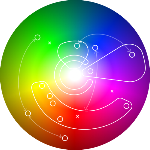
How we mapped our colour space
A colour wheen is your blank canvas. These are easy to knock up in Figma. It should go all the way to black at the edges but our app didn’t play in those spaces so I’ve left the darker tones off. (We’d have needed to go there for dark theme.)

First add the brand colours. Our primary brand colour was purple supported by aqua. Changing these was outside of the reasonable scope of product design so the are immovable pillars in our colour space. Brand color creep is always a challenge with a tendency for teams to over use brand colours. In our cse to stop the purplification of the product we needed a purple ‘no go’ zone. No colours in this space could be used. (We broke this rule twice and I regretted it deeply once.)

Next we added our core experience colours. These are the colours associated with the central experience of using the product. In our case we were an asset management platform and helping users understand the health of their asset flowed through pretty much every feature and journey. Asset health was a range from 1 through 5, the colours for each step were our core experience colours.

These colours deserve their own post, they needed to be colour-blind accessible and work on satelitte view map interfaces with basically any colour background. These colours took up a large swathe of the colour spectrum are were a defining part of UNITI4’s UI design.
After the asset health colours we needed to define UI helper colours. These were in roughly three parts 1) selected, focussed state, 2) success, warning, error colours 3) user defined label colours
We used our secondary brand colour – aqua – for selected states, check boxes, radio buttons, active menus and the like. So riffing of it’s blue-greeness we used various tones of light blue and green for the many combinations of selected, sorted, and focussed states we needed to support our data exploration interfaces.

Adding standard interaction colours for success, warning, and errors.

We had a feature where users could define their own taxonomies (tags) for various states of information. They could also choose a colour for each tag. At least for our first release of this feature I wanted to remove the risk of users creating colour combinations that were confusing when combined with other ways were were using colour, particularly the asset health colours. So for user defined tags we limited the colours to pastels with ‘pastel purple’ reserved for system-defined labels. (This was the one use of colour in the ‘brand purple defence zone’ that I didn’t regret!)

Finally! Finally, we had three extreme saturation colours used for miscellaneous data display on map satellite view. Not beautiful but reliable and effective.

Mapping the colour like this helped me manage colours and their functions in our product. I’m not sure I’ve not seen this done anywhere else like this so I thought it worth sharing.